March 24, 2013
Lisa: mom nest
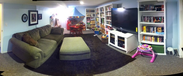
Since we can't afford to move to a bigger house, in February I embarked on a crusade to make some of the less-used areas of our house into places we wanted to spend time. My theory was that our house would suddenly seem twice as big if we had all this newly-useful space to hang out in during the day. The family room in the basement was at the crux of this plan. I wanted to take it from a dark, low-ceilinged hodgepodge with prickly industrial carpet to a light, bright, fun place the kids could play in while I worked. I was hoping we could work around Blake's TV and keep it a functional place for him to play games, but make it feel basically like the opposite of a man cave.
You can see the before pictures in this old entry from 2007, but here they are a bit bigger. I wish you could really see the silly-putty beige walls AND ceiling, and feel the gray plastic berber carpet.
Before:
Unfortunately, I didn't take any pictures of the in-between phases of the family room, when the slightly newer couch was moved down there, or when we handed the elliptical machine down to E and made a (less awesome) play area in there for the kids.
After:
E helped me so much with this project, guys. She came up with a bunch of great furniture arrangements on the Make Room Urban Barn room planner (including the layout we finally went with), and she put in many backbreaking hours painting walls in our poorly-ventilated basement and awkwardly leaning over bookcases in our freezing garage. I would never have gotten past the intimidation factor of what seemed like such a big project without her. Thanks, E!
We ended up moving Blake's computer desk and chair into the sewing room/guest bedroom to make more space for kid stuff, which I think was a great idea on Blake's part. It is snuggled up next to the carved chest in there, and it's not bugging anybody. I'm rarely sewing at the times he needs to use his computer, so we don't even get in each other's business.
The new light blue paint on the walls is Behr's Snowdrop (530A-1). I made myself go one shade lighter than I wanted to, and I'm so glad I did. It definitely comes across as blue, not bluish-white, and a darker color might have gotten oppressive in a basement with minimal windows. The ceiling and bookshelves are just the basic white Behr sells already in the can. I think the ceiling is flat and the bookshelves are semigloss. Even if we had just painted the ceiling white and left everything else, it would have been an improvement--why did the previous owners paint the ceiling beige in the first place?? Anyway. We primed the bookcases with Zinsser Bull's Eye Water-Based Primer/Sealer, in hopes that we could get the paint to stick without sanding. So far everything seems to be holding up, with no bleed-through from the pine stain.
The play kitchen is from Amazon, purchased for Nora's 2nd birthday. We got the easel from IKEA in 2009, and I supplemented it with a magazine rack and gallery wire, also from IKEA. The dollhouse was a hand-me-down from KC and Shannon, spruced up with a little scrapbook paper and Mod Podge, and given to Nora for Christmas in 2010. I have pictures of that, but I'm so behind on the girls' website that they aren't online yet. Maybe someday? The fun canopy was an IKEA find that just happened to match and fit perfectly.
The family photos over the couch are more of the sitting from Busath you saw in the living room upstairs. Since Hazel was but a fluttering in my uterus when we took those photos (gross, sorry), I cut out a silhouette of her cute face so she would be represented on the wall, too.
The area rug is a solid dark brown shag from Target. I looked at so many shag rugs and bound remnants, and the price range was huge. I finally threw up my hands and just bought a cheap version from the Target website, and to my surprise I completely love it! It's soft enough that it's pleasant for the kids to sit and play on, and the color is exactly what I had in mind. It sits on top of low-pile carpet, and it isn't a high traffic area, so I'm not too worried about the quality concerns of the commenters on the Target site. It's a great option to hold us over until we can get new wall-to-wall carpeting in the whole basement.
Inside those closet doors is my upgraded closet office, which you can see here. The brown and green actually work well with the new light blue and white palette in the family room, and I'm using my office a lot more than the kitchen table now that the kids like hanging out down there. Mission accomplished!

